


Moroj Investment is an agricultural investment fund for Egypt, opening the sector to small investors in a legal, regulated way. admepro did all of it: the name, the brand, the website and the social media.
Moroj Investment
Branding
Value starts from the land.
Moroj Investment is an agricultural investment fund for Egypt. Its aim is to open one of the country's most important growing sectors to small investors who want to invest with small amounts, legally and under the oversight of the Financial Regulatory Authority, while financing small farmers, developing agri-tech and raising exports and hard-currency inflows.
admepro did all of it. We named the fund, built the brand and its guidelines, designed and built the bilingual website, and created the social media system. The brand had to feel as honest as a field and as disciplined as finance: real, calm and measurable, never hyped.
01. The name
A name that says agriculture before a word of explanation.
Moroj, مروج, is Arabic for meadows: open green land that grows. It is short, it reads the same in Arabic and English, and it carries the land and the idea of growth in one word.
The logo is a sprout held inside a square with two cut corners: growth, protected. Everything else grows out of it. The same leaves become arrows for charts, tip up for growth and tip down for decline; the cut corner frames every photograph; and the palette runs from Moroj Green to Deep Forest and Midnight Forest, with Montserrat, Inter and IBM Plex Sans Arabic for type.
02. The brand
From seed to sprout.
The whole brand starts from a seed. On the website, a seed in the soil grows into a sprout as you scroll. We cut that sequence into a short film that ends on the logo, the same story the brand tells everywhere: value starts from the land.
03. Social media
The feed, as it runs on Instagram.
We built a full social media kit: post templates, carousels, stories, highlight covers and the launch campaign, Invest in the asset, استثمر في الأصل, with its own Arabic lettering.
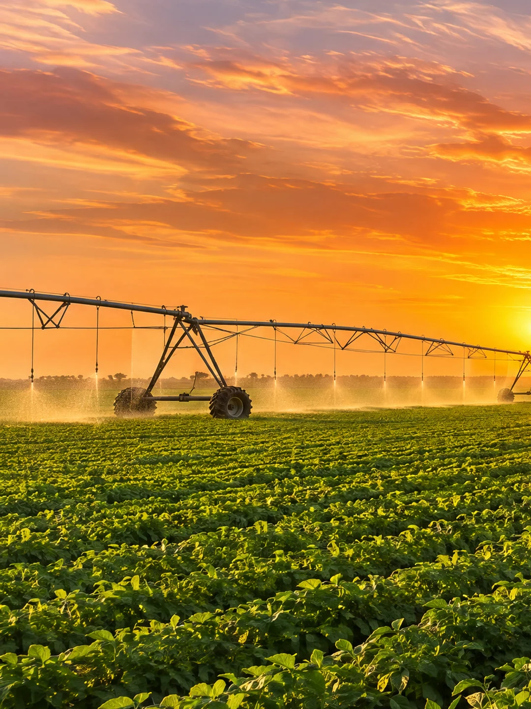
Posts carry the handle and the leaf, never the full logo, so the feed is recognised by Moroj Green, the cut corner and the sprout. Real photography alternates with clean green and white cards, and three posts join into one sunset panorama across the grid.



04. In the field
One mark, from the field to the office.
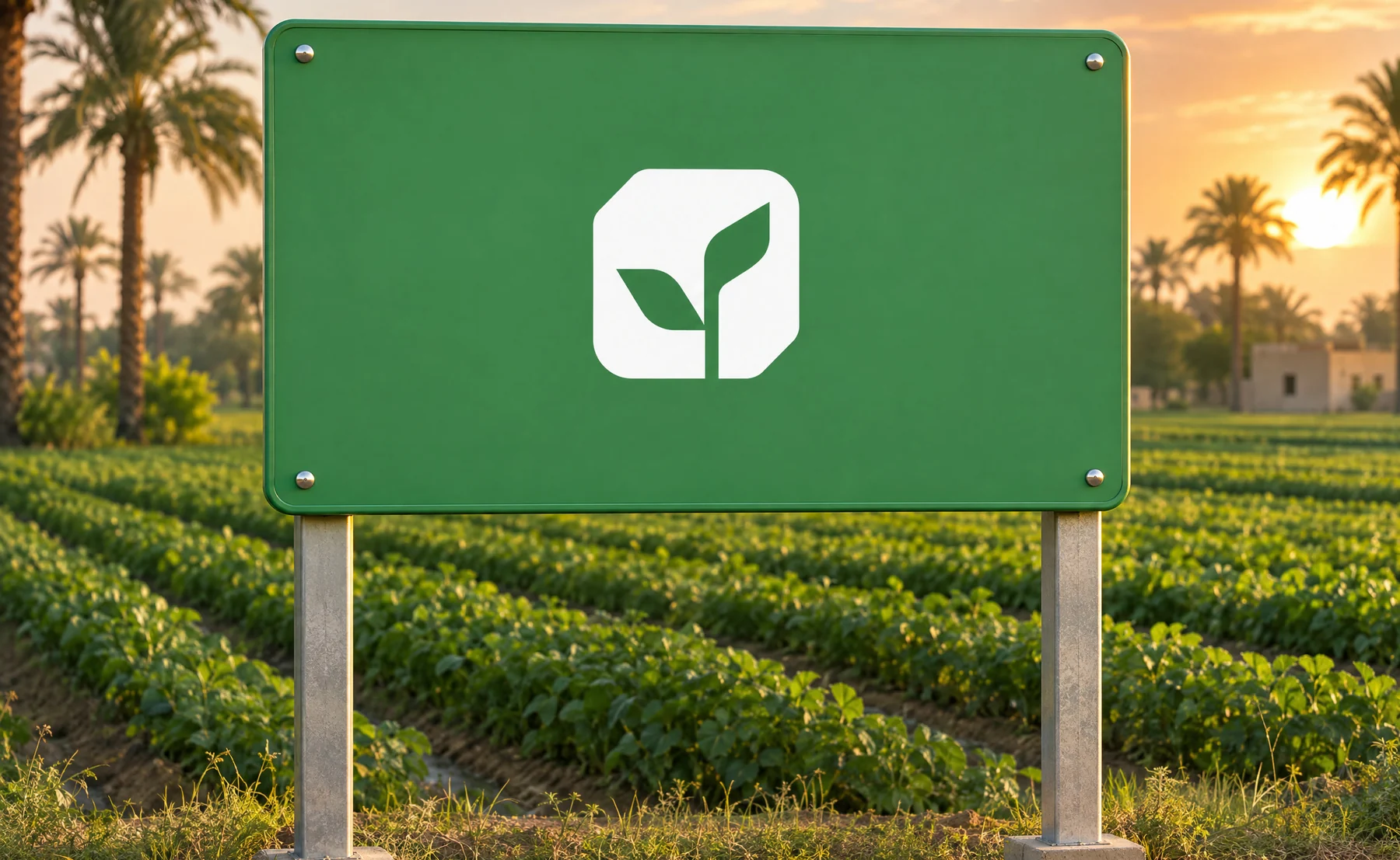
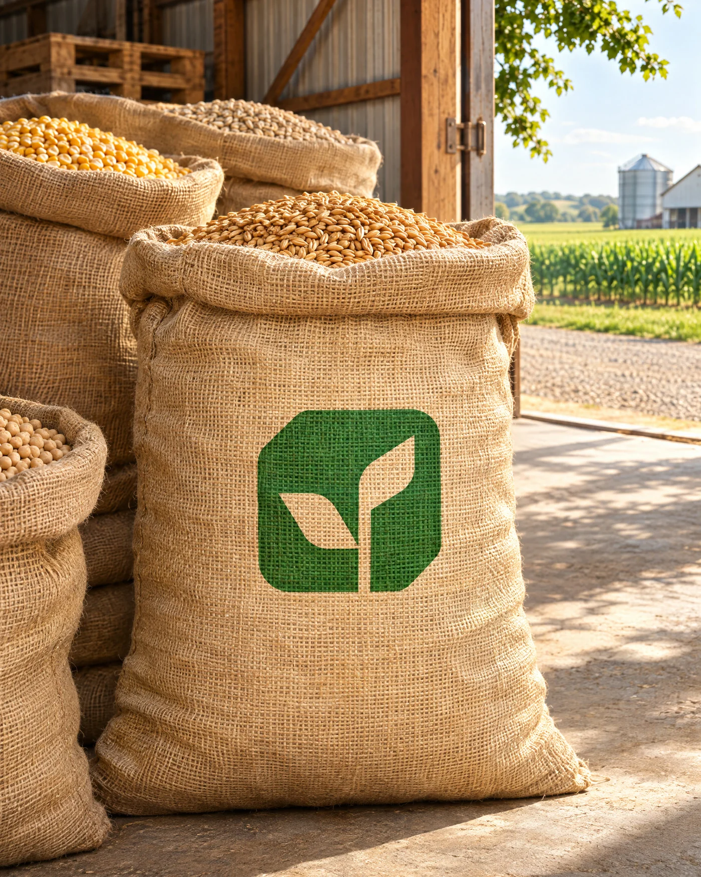
In the field the icon works alone, on signs, gates and greenhouses, always on a clean brand-colour panel. Vehicles carry the green logo on white and produce sacks carry the icon in one colour.
In the office, business cards, letterheads, envelopes, investor statements, reports and factsheets all sit on the same quiet grid. Figures shown are for layout only.


05. Photography
Real land, warm light.
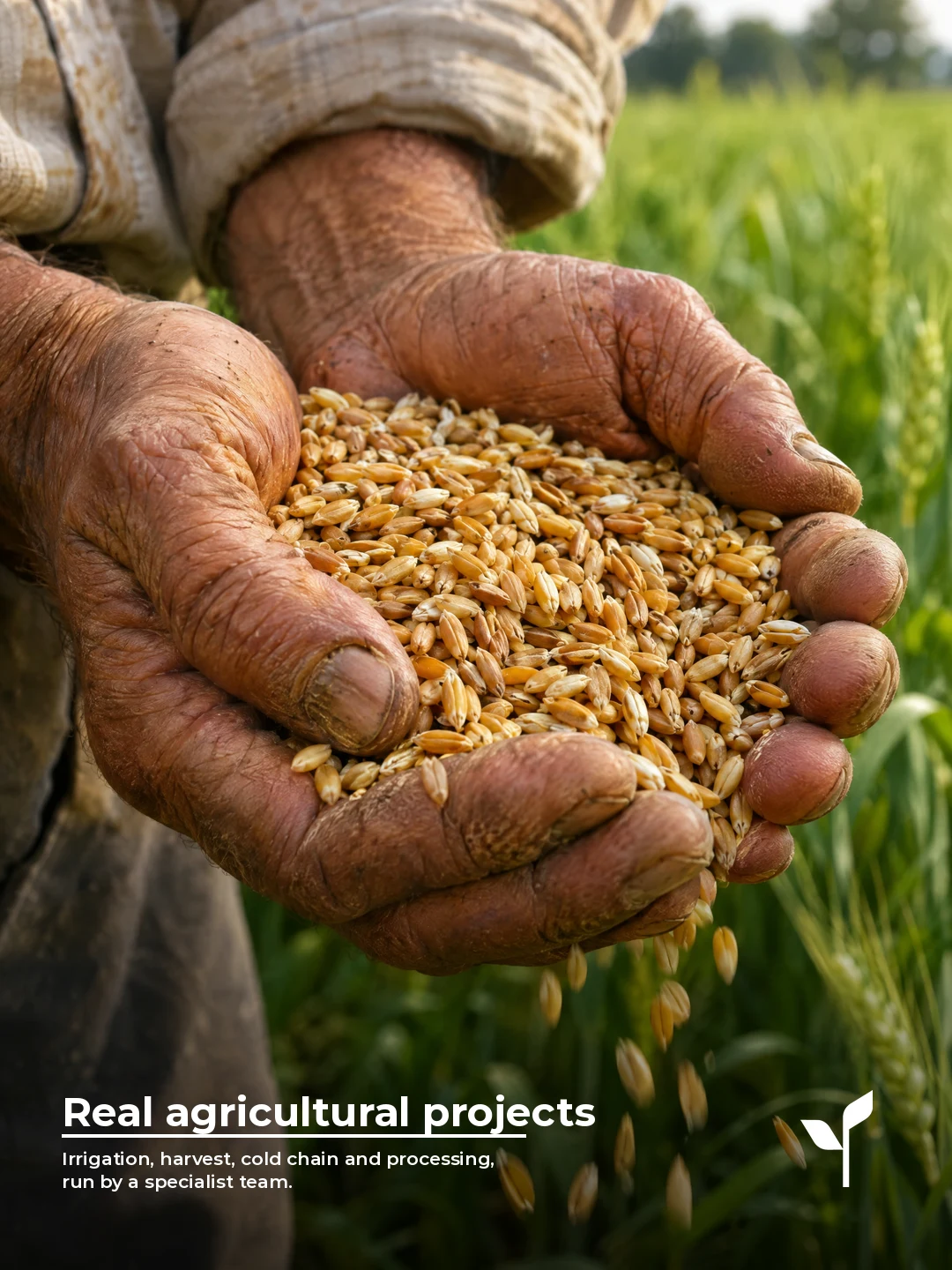
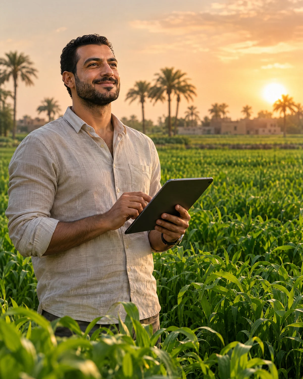
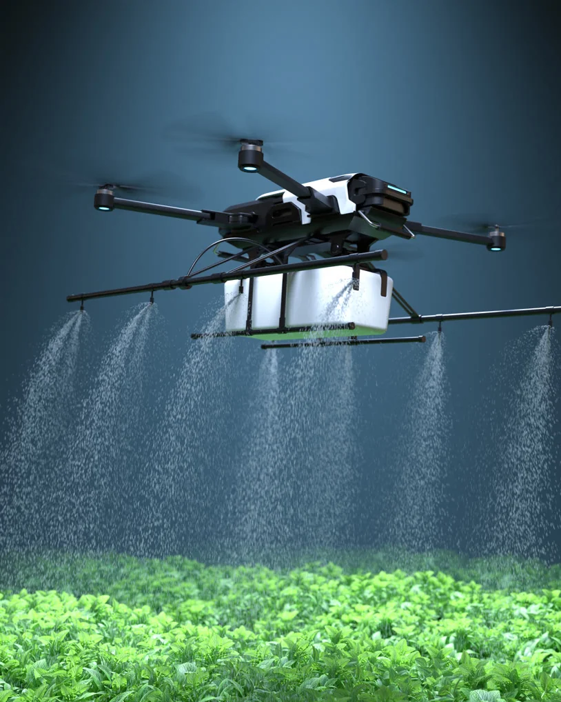
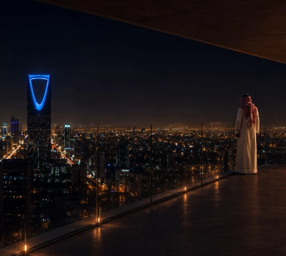
Two worlds, one light. We pair the land, fields, harvest, farmers and engineers, with the discipline of investment: real meetings and real numbers. Both are shot in warm natural light with deep greens; no stock clichés, no cold blue offices.
The mix is roughly two agriculture images for every investment image, and investment photos always keep a trace of the field: a plant, a window to the crops, soil.


06. The website
A seed that grows as you scroll.
We designed and built morojinvestment.com. The home page opens on a seed in the soil that grows into a sprout as you scroll, then walks through the mission and vision, the four goals, Egyptian press coverage and the latest insights on agriculture and investment.
Inner pages cover the sector in numbers, the plan and FAQ, and a form to register interest. The site works in English and Arabic, with a true right-to-left Arabic version. Scroll inside the window to explore it.

Let's Collaborate
Have a project like this?
Book a free 30-minute call.
We're a team of creatives who are excited about unique ideas.