

Branding · November 10, 2026
Maintrix
Maintrix is a Saudi industrial services brand. We built an identity as precise as the work itself: a geometric logomark, a heavy wordmark, a strict red, black and white system, a bilingual type setup and a brand guideline of 57 pages.
01. Logo System
A mark built from repeating lines, like a structure under load.
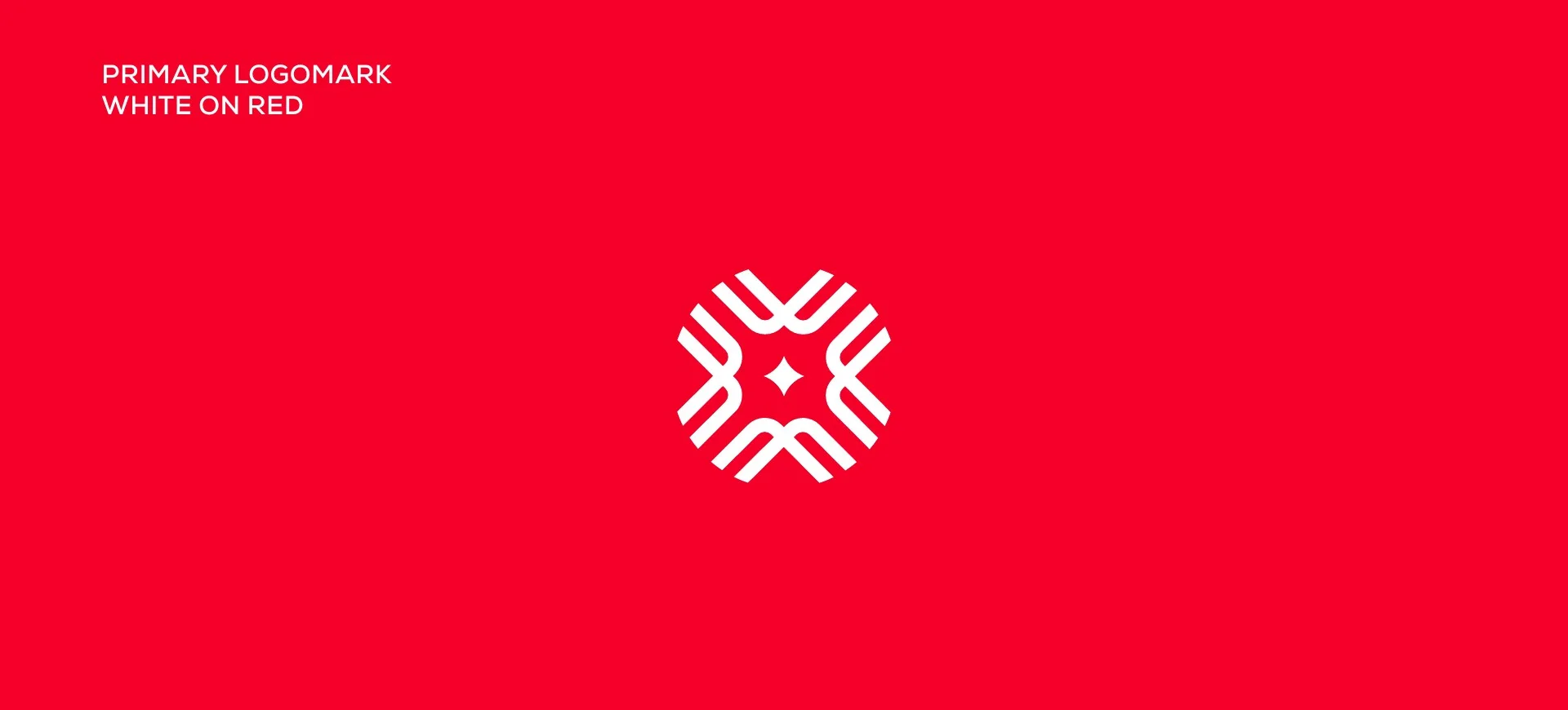
The logomark is a symmetrical star made of stepped, repeating strokes. It reads as maintenance, structure and precision at any size, and it pairs with a bold, tightly spaced wordmark.
The guideline covers construction, safe zones, colour versions and misuse examples, so every team and supplier applies the logo the same way.



02. Colour, Type & Pattern
Red as the signal, black and white as the structure.
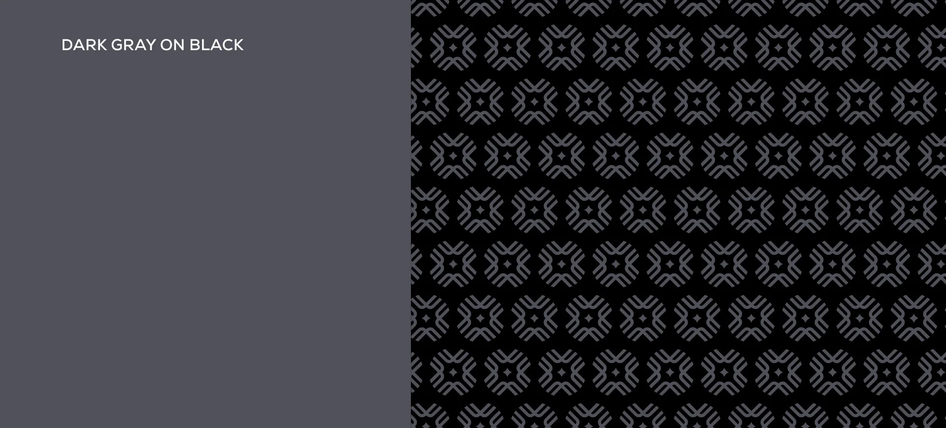
A crimson red used sparingly on black, white and two greys keeps the brand serious and easy to spot. Nexa and Montserrat Arabic handle English and Arabic with the same weight and rhythm.
The logomark also repeats into a tonal pattern for stationery, packaging and walls.



03. Stationery
Every touchpoint carries the same signal.
Business cards, ID badges and lanyards, notebooks and envelopes were designed with the pattern and a single red accent, in matching light and dark versions.


04. Brand in the Field
From the head office to the work site.
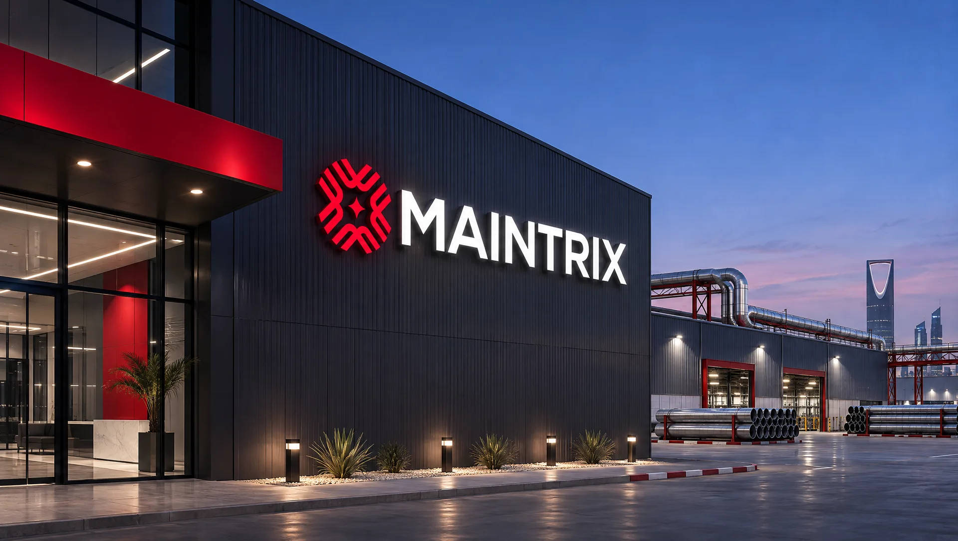
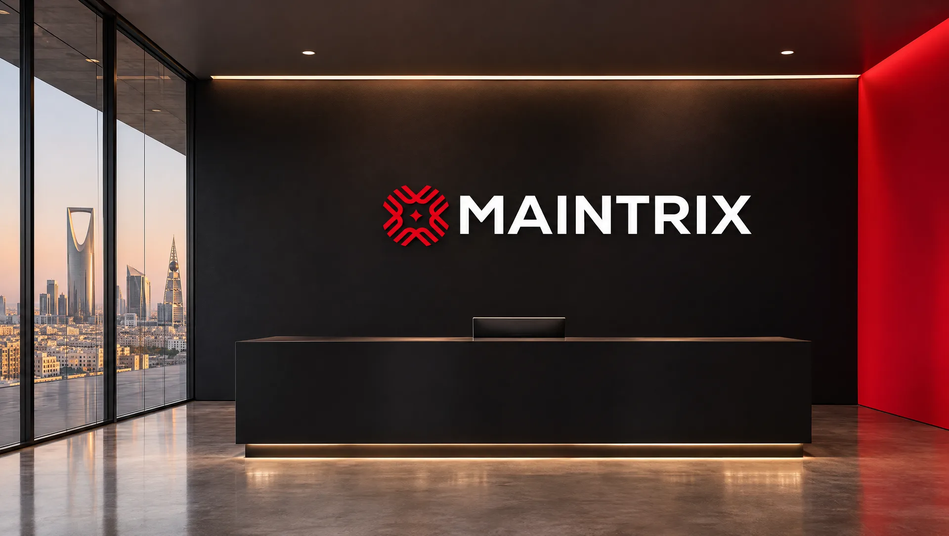
To show how the system scales, we built concept visuals with AI: a headquarters facade, reception, uniforms, safety gear and site signage, with the fleet in the brand livery above. They are mood visuals for the case study, not photographs of real sites.


Let's Collaborate
Send us an email,
to discuss a new project.
We're a team of creatives who are excited about unique ideas.